
Numlock Sunday: Erin Davis on books and bodies
By Walt Hickey
Welcome to the Numlock Sunday edition. Each week, I'll sit down with an author or a writer behind one of the stories covered in a previous weekday edition for a casual conversation about what they wrote.
This week, I spoke to Erin Davis, who wrote The Physical Traits that Define Men and Women in Literature for The Pudding. Here's what I wrote about it:
A new analysis of 2,000 books found that lots and lots of authors are shamelessly horny on main, describing the bodies of male characters and female characters in distinctly different depth and language. If an author was describing a thigh, it was 1.6 times as likely to be a woman’s, a skew that applied to hair (2.27 times more likely for women), lips (1.26), hips (2.29), waists (2.25), breasts (6.61), and nails (2.03). Meanwhile, men disproportionately saw their thumbs (1.91), fists (2.03), knuckles (1.61), backs (2.85), jaws (1.75), brains (1.61) and grins (3.02) described. Such skews also applied to adjectives used to describe bodies — women are more likely to be “soft” or “slender," men more “big” or “hard” — and honestly, now I just want to read a book about a women who’s all knuckles and a dude who’s got rockin’ hips.
I loved this story because I’m personally obsessed with this kind of cultural data journalism, it’s a deeply cool story relying on some exciting techniques in natural language processing, and it put hard numbers to things that lots of us knew pretty implicitly. It’s a great visual package.
We spoke about how this story came to be, we chatted about the process and how it can be pretty circuitous, and also a little about some of her other cool visualizations about music and cities.
Erin’s story can be found at The Pudding, she’s on Twitter and her website’s got all her work.
This interview has been condensed and edited.
The Pudding, Illustrations by Liana Sposto
Okay, Erin, you wrote a really cool story in The Pudding all about gendered descriptions in books. Can you tell me a little bit about where this idea came from?
My friend Liana Sposto illustrated it, I cannot give her enough credit for that. This came from a little text chain book club I have with Liana and one other friend. We read fantasy novels, usually pretty terrible fantasy novels. Like I say in the article, we were reading The Wise Man’s Fear by Patrick Rothfuss, in which the main character gets sucked into the clutches of a super sexy fairy, and then basically has sex with her for the next 30 pages. It was so bad, and he kept describing her naked body, her supple body, her luscious breasts, and we were all just sort of rolling our eyes like, "This is absurd. Is there any way we can quantify how absurd this is?"
Wait, is this the sequel to Name of the Wind?
Yeah, it is.
Got it.
To start with, Liana was trying to goad me into doing this for her, because she was suggesting that she was just going to read the book and sit down with a pen and paper and count everything. I'm like, "No, no, no, no, no, no, no."

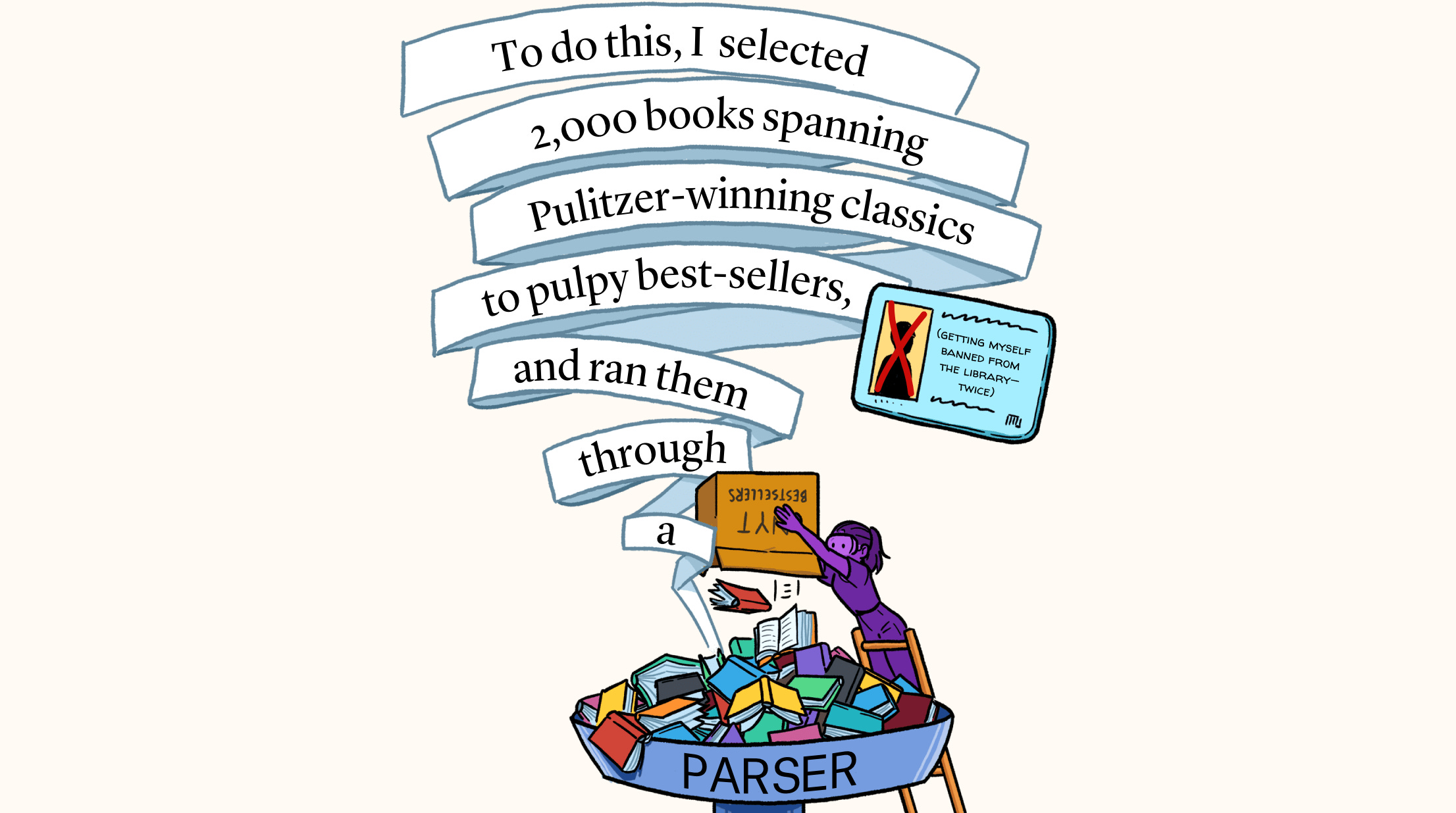
I had never done any sort of text analysis before and I learned all about natural language processing, where you just feed in a language, and far better computer scientists than I figure out how to associate words with the part of speech or associate words with each other like, "This word describes that word, or this body part belongs to that character." I did a lot of Googling and slowly started to piece together some code.
You incorporated something like 2,000 books, and you basically found out how different body parts corresponded to different characters and then the gender of those characters, and then kind of found out some really fascinating conclusions about the gender skew of how bodies get described in literature. Do you want to go into some of what you found?
I mean, honestly, it wasn't that surprising. It is pretty much exactly what you would think would be the case is the case. Mainly, women are described more as supple and soft and sweet and small, and men are rough and big, and they'd have their legs described more and their fists described more, whereas women, it's their lips and their hips and their thighs. So, all the stereotypes that you might expect to be there are in fact there.
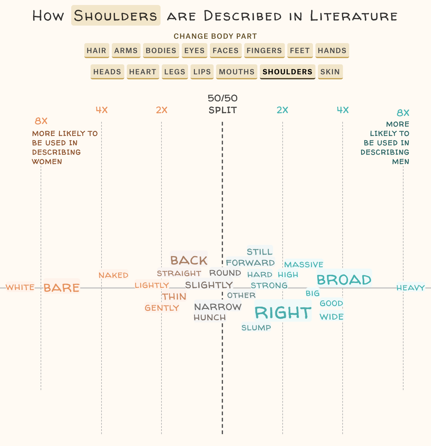
One that I just thought was so clearly summed up was some of the obvious problems are shoulders. For women, they tend to be white, bare, naked, gently, lightly. For men, they tend to be broad, heavy, wide, big, good.
It was honestly a little disappointing. I was hoping I would find something different, but I got what I expected.
The Pudding
What was interesting to me as well is that about 35 percent of the books that you pulled had a female author.
I think we're all sort of conditioned by the same society. Just because I'm a woman doesn't mean that I grew up any differently in terms of what I've been exposed to than a man. I am just as likely to think of a woman as soft and weak, perhaps.
So, not even necessarily about the authors, it's about patriarchy.
As always.
It always comes back to that. What was the most fun part of this project for you?
I think it was working with Liana, to be honest. I've known her for 18 years. I met her when I was 11. She's always been an amazing artist, and she was like the girl in middle school that everyone knew. I never got a chance to work with her on a professional level, and it was cool to ramble at her about data, and she would just draw it out as I spoke. It was honestly magical for a really data person to see that art person bring it to life.

See full graphic at Erin Davis’ website
This is a visual essay that you wrote for The Pudding. I'm a big fan of them. But I was going through some of your work and your catalog and I have seen your work everywhere. You write a lot about maps. You write a lot about geography and street networks and all that kind of stuff. I would love to hear a little bit more about your work on that work, like the street orientations graphic you made.
I forget the name of the man who did the original one, but it was such a cool idea to use a polar histogram to show what direction streets in a city tend to go. Most American cities will be north and south. In European cities, it'll be just every old direction.
I wanted to take that and break it down one step further into what type of streets go in which direction.
In Portland, streets go east-west and avenues go north-south. I wanted to show that in some way and show the differences between cities. The idea wasn't original, but I thought it was a really cool challenge to pick apart the original code. It was really exciting, too. I essentially wanted to do that as a challenge to figure out if I could do that. I think a lot of my work just ends up being some random idea and the fun of it is sort of in the process, not necessarily in the output.
You've also done some work on things with music, you were able to figure out which genres are most likely to provoke a one-hit wonder.
Like everything else, this one I didn't really start out with the idea of like, "I'm going to do this." It evolved from another project. And as I was working on that project, I started to realize a lot of artists have one song that's played far more often on Spotify than any of their other songs and I saw this one as a challenge in data collection. To say what is the biggest one-hit wonder, you have to collect all songs from everybody or else what you're making isn't really founded in data, it's just founded on a subset of the data. The big challenge for me was figuring out how I could get data on every single song by every single artist on Spotify.

See full story on Erin Davis’ website
Again, I turned to Google and that's pretty much where everything first comes from, randomly Googling until I can latch onto something. Someone, a far better computer scientist than I, had put together an API that will let you pull from the Spotify desktop application all plays from all songs from all albums of a given artist. All I had to do is get all albums from all artists then plug that into the API and, boom, two months later, I have an article.
Again, the output was nice and it was cool to see it, but for me, it was far more about the process of like, "Can I actually pull this off?"
I am enjoying how so much of this is the journey rather than simply solving things.
Yeah, you should see the graveyard of stuff I have where perhaps I solved it, but the output wasn't that cool or the process honestly wasn't that interesting, so they're just languishing.
Everybody's got that folder of projects that "Perhaps one day." You never know.
It makes me sad, so I have it in a sub-folder in a sub-folder.
To wrap everything up, where can people find you? Anything coming down the pipeline that is fun?
My website is erdavis.com and on social media, I'm @erindataviz. Right now, I'm working on something I'm almost done with it. It's seeing how emoji are used together.
That sounds really fun.
It started from a conversation at work where my Gen X colleague was not aware of the alternate meanings of the eggplant and the peach.
Oh, no.
All the millennials were trying to explain to him what they really meant. It occurred to me like with words when you read something and you don't know a word, you can often figure out what it means with the words around it. I was thinking emojis could be the same thing. If you don't know what the subtext of emojis are maybe you could see how they're used with other emojis and you're like, "Ah, that peach probably isn't just a fruit."
If you have anything you’d like to see in this Sunday special, shoot me an email. Comment below! Thanks for reading, and thanks so much for supporting Numlock.
Thank you so much for becoming a paid subscriber!
Send links to me on Twitter at @WaltHickey or email me with numbers, tips, or feedback at walt@numlock.news.
